



Description
Visual Details:
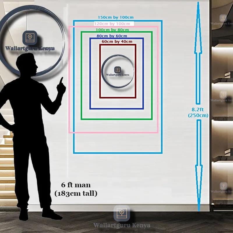
This elegant triptych presents an exercise in minimalist abstraction through the language of flowing, organic forms. The three-panel composition features undulating bands of color—forest green, sage green, golden mustard, and cream—that ripple horizontally across pristine white grounds like stylized landscapes, topographical maps, or perhaps the gentle swell of ocean waves viewed from above. Each panel contains its own variation on the theme: waves that overlap, intersect, and create rhythmic visual movement from left to right across the entire composition.
The artistic approach is deliberately restrained yet sophisticated. The forms are rendered with clean edges and flat color application, creating graphic clarity while the organic, hand-drawn quality of the curves prevents the work from feeling mechanical or rigid. There’s beautiful tension between geometric precision and natural flow—the bands are controlled and architectural, yet they evoke the randomness and fluidity of natural phenomena. The color palette is earthy and contemporary: the combination of forest and sage greens with warm golden ochre suggests landscapes at different seasons, layers of sedimentary rock, or perhaps the meeting of land and water.
The white negative space is crucial—it allows each colored band to breathe independently while creating overall cohesion. The triptych format adds dimensionality and visual interest; the waves don’t simply continue across panels but rather create variations on a theme, like musical movements or chapters in a narrative. The overall effect is simultaneously calming and dynamic, simple and sophisticated—abstract art that rewards sustained viewing while maintaining immediate visual appeal.
FOR WHOM:
This piece speaks to collectors who appreciate minimalist aesthetics, admirers of Scandinavian and Japanese design principles, and patrons who value artwork that enhances spaces without overwhelming them. Ideal for those building collections around organic abstraction, landscape-inspired work, or contemporary geometric art. Perfect for collectors who favor earth tones, natural palettes, and artwork that creates visual calm while maintaining interest.
This work resonates with individuals seeking art that complements rather than dominates their living spaces—those who understand that restraint can be as powerful as complexity. Suitable for design-conscious homeowners, admirers of biophilic design bringing natural elements indoors, or anyone drawn to the intersection of contemporary art and nature-inspired forms. An excellent acquisition for emerging collectors seeking approachable contemporary abstraction, or established patrons looking for pieces that integrate seamlessly into curated, design-forward environments. This appeals particularly to those who value versatility—artwork that anchors a room while allowing decor flexibility around it.
WHERE TO DISPLAY:
- Living rooms above sofas or sectionals where the horizontal triptych format mirrors furniture proportions
- Bedrooms as headboard alternative creating serene, nature-inspired focal points
- Dining rooms where the earthy palette complements wood tables and natural materials
- Home offices and workspaces providing visual calm without distraction
- Entryways and hallways where the horizontal flow guides movement through space
- Scandinavian, minimalist, or mid-century modern interiors where clean aesthetics dominate
- Coastal homes and beach houses where the wave-like forms echo maritime environments
- Wellness centers, yoga studios, and meditation spaces creating peaceful atmospheres
- Boutique hotels and Airbnb properties seeking universally appealing, contemporary artwork
- Corporate offices and reception areas in companies valuing modern, approachable design
- Healthcare facilities and waiting rooms where calming visuals support patient wellbeing
- Contemporary nurseries and children’s spaces providing visual stimulation without overstimulation
DESIGN NOTES:
The three-panel horizontal triptych format is exceptionally versatile and impactful. The panels can be hung closely together for unified composition or spaced apart for more architectural, gallery-style presentation. The staging photograph demonstrates effective close spacing with minimal gaps—this creates cohesive visual statement while the panel divisions add dimensional interest through subtle shadow play.
Wall color consideration: The predominantly white background means this work adapts beautifully to any wall color. Against white or cream walls (as shown in staging), the piece provides gentle color interest without disrupting minimalist aesthetics. On colored walls—particularly in shades present within the artwork (sage green, warm gray, soft gold)—the piece creates sophisticated tonal conversations. The work also excels on darker walls (charcoal, navy, forest green) where the white grounds appear to glow, creating striking contrast.
Ideal companion elements: This piece harmonizes exquisitely with natural materials and organic forms. Consider pairing with light or medium wood furniture (oak, ash, walnut), linen and cotton textiles in neutrals or earth tones, ceramic and stoneware vessels, rattan and wicker accents, live plants (particularly those with flowing or architectural forms), and stone or concrete surfaces. The color palette specifically complements: mustard yellow accents (as shown with staging pillow), navy or deep teal for contrast, cream and warm whites, and natural jute or sisal textures.
The piece works beautifully in both warm and cool color schemes: pull the golden tones for cozy, earthy environments, or emphasize the cooler greens for fresh, contemporary spaces. This chromatic flexibility makes the work remarkably versatile through seasonal decor changes or style evolution.
Scale and proportion: The staging photograph demonstrates ideal proportions—the triptych spans approximately the width of the sofa below with slight margin on each side. This creates balanced visual weight. For triptychs, calculate total width including spacing between panels to ensure proper proportioning. The three-panel format provides substantial presence without requiring extremely large individual pieces, making this format ideal for moderate wall spaces.
Panel arrangement: While horizontal alignment (as shown) is standard, consider creative alternatives: slightly offset heights for dynamic effect, or even vertical stacking of two panels with one centered below for unconventional impact. However, the traditional horizontal arrangement best serves the flowing, landscape-like quality of the composition.
Framing considerations: Simple float frames in natural wood (light oak, maple, or ash) complement the organic subject and earthy palette. Matte black frames create crisp, gallery-style presentation with more graphic impact. White or cream frames maintain seamless, minimalist aesthetic where frames nearly disappear. Canvas gallery wraps without frames offer contemporary, accessible presentation. Ensure frames are identical across all three panels for visual cohesion.
Lighting: This work doesn’t demand dramatic lighting but benefits from even, natural illumination that reveals the subtle color relationships and clean edges. Warm artificial lighting (2700-3000K) enhances the golden tones and creates inviting atmosphere; cooler lighting emphasizes the greens for fresher, more contemporary feel. Avoid harsh spotlighting that creates glare on the white surfaces.
Styling synergy: The staging photograph demonstrates excellent companion styling—note how the geometric patterned pillow echoes the linear quality while the organic branches in the clear vessel reference natural forms. The navy pillow provides deeper value that grounds the composition. The overall effect is curated but not contrived, allowing the artwork to anchor the space while remaining part of cohesive design story.
Seasonal and temporal adaptability: The earth tone palette feels appropriate year-round—greens and golds work beautifully in spring and summer suggesting lush landscapes, while the same colors evoke autumn fields and winter evergreens in cooler months. This temporal flexibility means the piece never feels seasonally dated.
Installation consideration: For triptychs, precise alignment is crucial. Use level, measure carefully, and consider creating paper templates before hanging to ensure even spacing and alignment. The visual impact depends on professional, precise installation where all three pieces form unified composition.
Reviews
There are no reviews yet.